

ViewUs is an early-stage SaaS startup building a testimonial collection tool for small businesses looking to improve their sales and marketing strategy. I joined the team after the product was conceptualized but before any features were designed or built.
As the sole designer, I was responsible for fashioning the entire user experience, from the sitemap and user flows to the designs and prototypes for the initial launch.


THE VISION
Start to finish in under 10 minutes
Our target audience consisted of small teams with limited time and technical capabilities to source, design, and code their own testimonial spotlights, and we wanted to meet them where they were. The goal was to create a process for businesses to launch a request questionnaire and start collecting testimonials within 5-10 minutes.
PRODUCT DIRECTION
Exploring frameworks
To narrow the scope, I explored three design concepts that addressed different concerns surfaced during research.
Design tool editor
Competitor tools didn't make it clear how user decisions would affect what survey takers saw. This model allowed businesses to edit pages directly.
Full flexibility
This building blocks framework would provide different components that businesses could add or adjust based on individual needs.
Guided flow
This structure prioritized ease of use, trading some flexibility for a more intuitive flow that guided users step-by-step.


ITERATIONS
Breaking our design biases
The final step of the user flow was customizing the look and feel of the questionnaire. As a designer, I saw this as an opportunity for businesses to have fun and showcase their brand.
But feedback from early users indicated that we had over-indexed on creative expression when speed to launch was a greater priority.

So after checking ourselves, here's the before and after
SIMPLICITY VS. CHOICE
How much is too much
Initially, I leaned towards a more granular level of detail so businesses could make creative choices based on internal design guidelines. But after considering potential edge cases like inaccessible background and font color pairings, I opted for a simpler approach.
BEFORE

AFTER

BUILDING A COHESIVE EXPERIENCE
Consistency is hard
Sometimes you get caught up with the specific challenges of each step and forget to see the whole flow as a set.
Visual inconsistencies started becoming noticeable as I put the pieces together.
DESIGN DETAILS
Making things easy
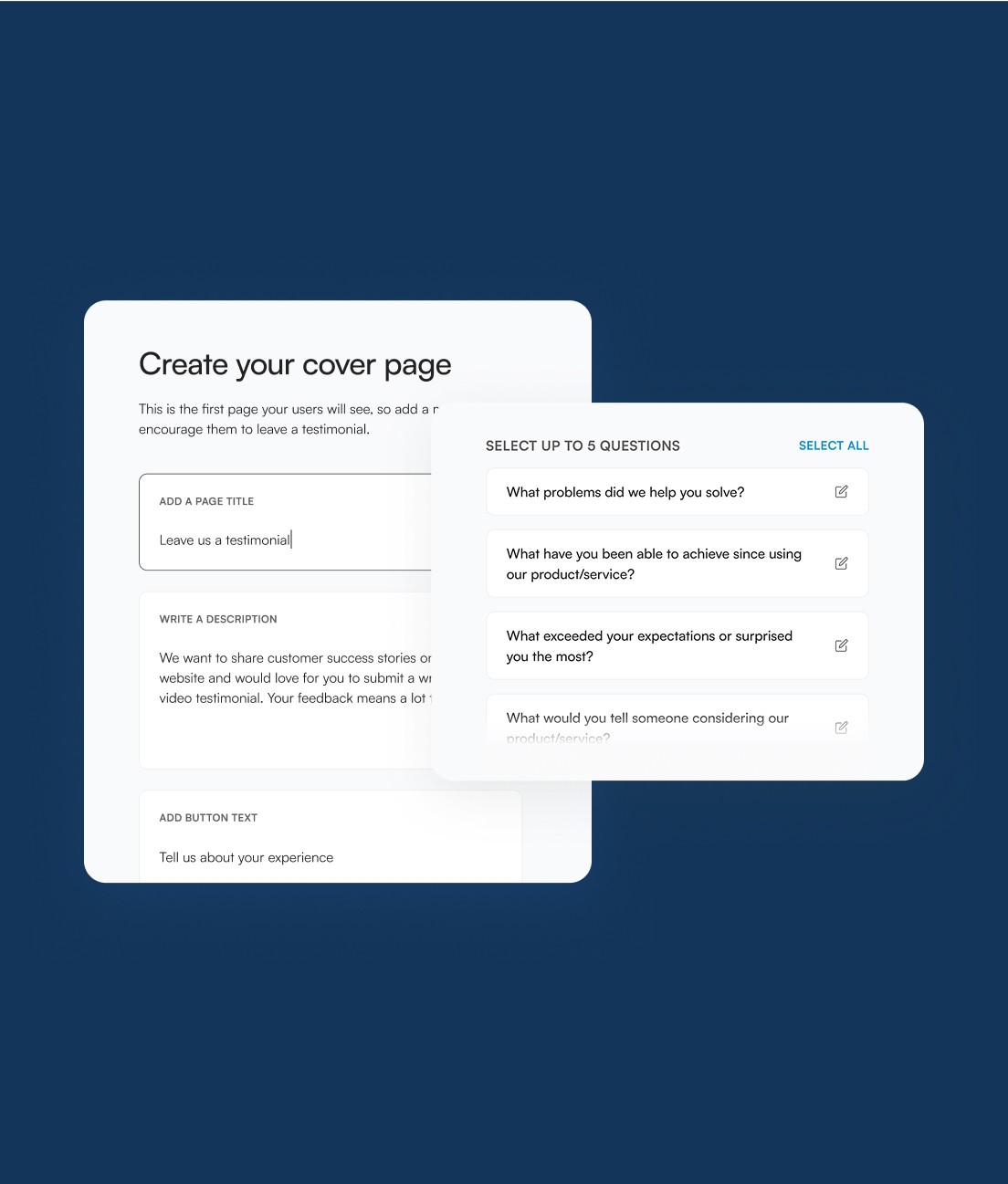
With speed to launch as the north star, several factors were considered to make the user experience as seamless as possible.
A large preview illustrated how decisions affected the customer-view, and users could save their progress and jump to different steps of the flow. Pre-selected choices and pre-filled text gave businesses the option to move through the flow quickly, while still allowing them to make edits if necessary.
LARGE PREVIEW
EASY NAVIGATION
PRE-FILLED SUGGESTIONS
Key takeaways
Avoid designer bias creep
Keeping the target audience in mind was critical; our users didn't need complex design capabilities.
Simplicity isn't a dirty word
Sometimes constraints were a positive. A simpler design step meant a lower chance of inaccessibility and allowed users to launch their testimonial questionnaires faster.
Reusing visual patterns for a cohesive experience
Small differences in visual design seemed inconsequential in the moment, but a zoom-out revealed how inconsistencies could compound.