


The brief: Bootstrapping a video feature to connect home swappers with a young startup
Mi Casa launched in July 2023 as an online marketplace for travelers interested in swapping homes. Building a strong foundation of trust and safety was vital to gaining initial traction and increasing the number of home swaps. I led the research and design of a video feature that allowed users to meet virtually to gain the confidence to move forward.
THE CONTEXT
Research showed that establishing trust between users was critical before they'd commit


A PROGRESSIVE APPROACH
Starting with video: The first of many steps to building trust and safety
We started with a product solution first, with plans to revisit additional assurances like host liability insurance in the future.
THE CHALLENGE
Making lemonade out of lemons, an imperfect but sufficient solution
The team was no stranger to embracing constraints, just another facet of life as a bootstrapped startup. This meant balancing user needs with the immediately achievable.
Constrained to desktop
Desktop was the best vehicle because the mobile app was further down the roadmap.
Low engineering effort preferred to reduce costs
Mi Casa's development was outsourced, so less was more.
Video features dependent on API
Engineering planned to utilize video calling APIs with limited product customization.
USER RESEARCH
Users satisfied with no frills video
I conducted six user interviews with past survey participants who indicated interest in using the platform to travel for 4-8 weeks or more. Users noted that basic features satisfied their needs, since the use case was simple.
Despite being constrained to desktop, this research gave us the confidence to move forward with an MVP.
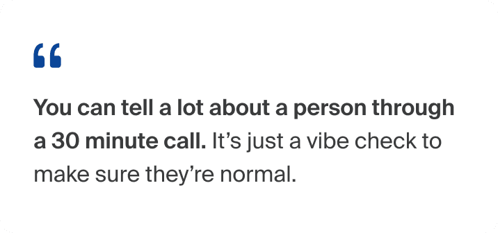
Video calls were a necessary but basic check-the-box
If other safety measures were in place, calls served primarily as a sense check.
Phone > laptop
Users could more easily move around and flip their cameras to show their homes.
No need for bells and whistles
Users preferred strong video quality over excess features.
COMPETITIVE ANALYSIS
Starting wide and prioritizing based on user feedback
Mapping the full spectrum of features offered by existing video conferencing tools provided a solid starting point to define the MVP. The list was then prioritized based on feedback from user interviews and perceived utility for the primary use case: a two-person call to meet and show their homes.


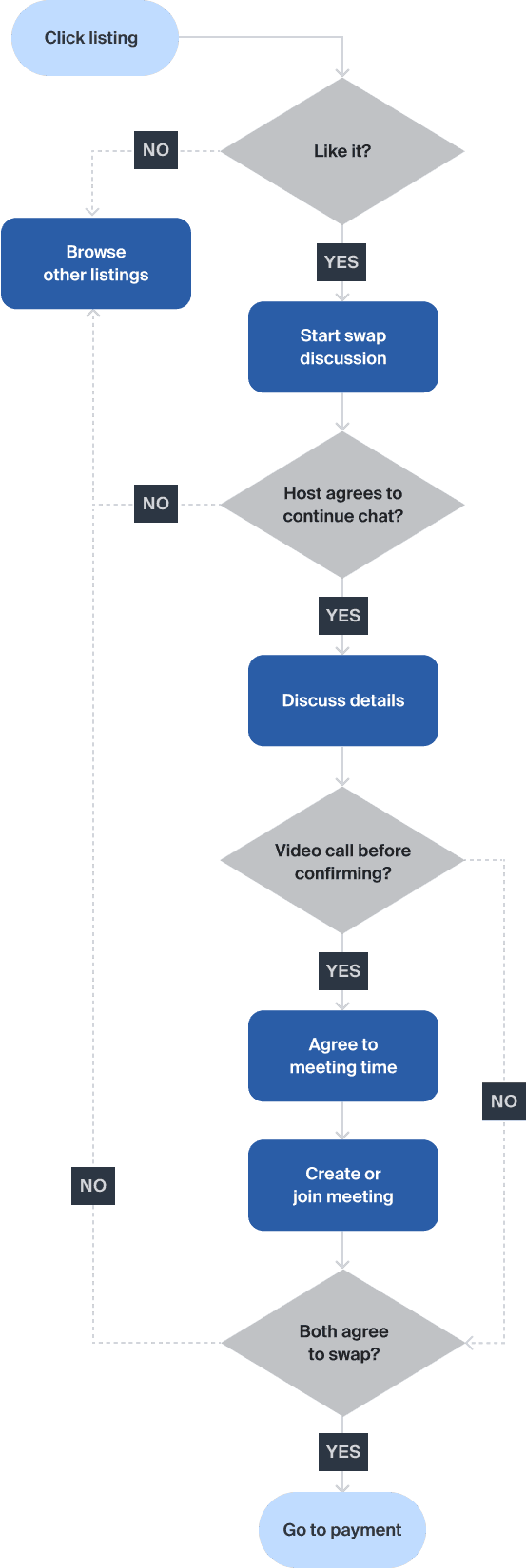
TASK FLOW
Mapping the user journey

FINAL DESIGN PREVIEW
The highlights


DESIGN EXPLORATIONS
Exploring entry points
It made sense to house the new video feature within the existing "Messages" architecture, the place users knew to go when they wanted to chat to other home swappers.
The task at hand was to create a highly visible entry point that encouraged utilization. We didn't want to this to become one of those features that was "there if you need it" but rather one that actively moved the needle in cultivating trust among users.
Exploration #1: Conversation Tips section
Placing the entry point in a section dedicated to improving chats felt intuitive.

Exploration #2: Header placement
The header was an optimal location given its visual hierarchy on the page.

Exploration #3: Icon button in the message box
It was common to find video and voice notes housed in the message box.

Exploration #4: Alert prompt in the message body
By prompting users to start a video, we hoped this would encourage usage.

Selected design: Combining explorations #2-4
I pulled aspects of various explorations to create the final design. An icon button in the header offered a fixed entry point but took up less space. The green alert stood out and encouraged users to conduct video calls.

DESIGN EXPLORATIONS
Joining a video call
When designing the way that users join calls started by another person, a key consideration was prominence. We wanted to reduce the chance that they missed a call.
Exploration #1: Join via message alert
This method of alerting users was consistent with the way they found out about other changes in the home swap process.

Exploration #2: More detailed message alert
This updated alert provided more information and the ability to decline.

Selected design: Modal
The modal would grab the user's undivided attention and ensure they didn't miss the meeting, since the MVP didn't have scheduling capabilities.

Adding camera preview after usability testing
During usability testing, 3/6 participants identified the lack of a camera preview as a potential deterrent to joining the call immediately. Though the original flow took users to another page with the camera preview, I simplified these steps by adding it directly to the modal.

DE-RISKING INSTANT VIDEO
Preventing missed calls
The MVP state required users to agree on times over messaging, then remember to join the call at the stated time. Instant video was less risky on mobile, as people tended to be on their phones more often, but we feared that our desktop video feature would result in more missed calls.
To de-risk some of our concerns, we added online statuses and text reminders to help users reach those who may have forgotten to join.

FUTURE VISION
Envisioning a V2 with scheduling
Resource constraints meant we chose to rollout the video feature in increments. We imagined an end state that incorporated scheduling capabilities but wanted to understand user utilization of the feature before making changes to the sitemap.
